|
DESIGN
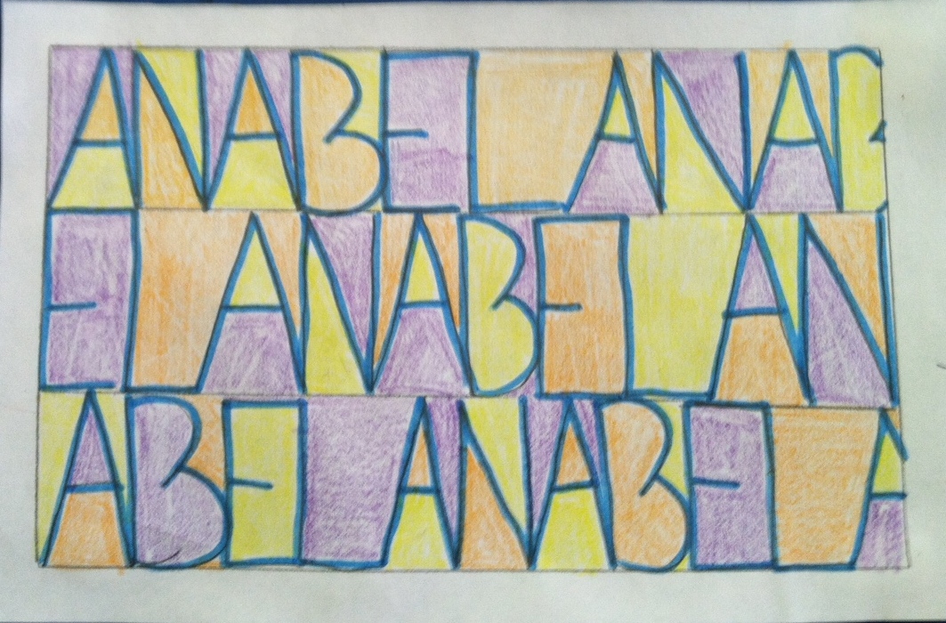
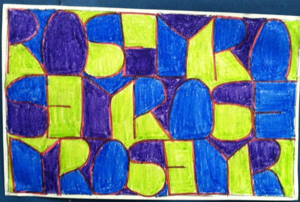
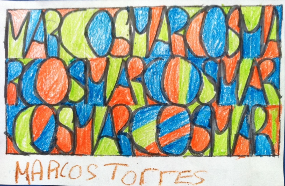
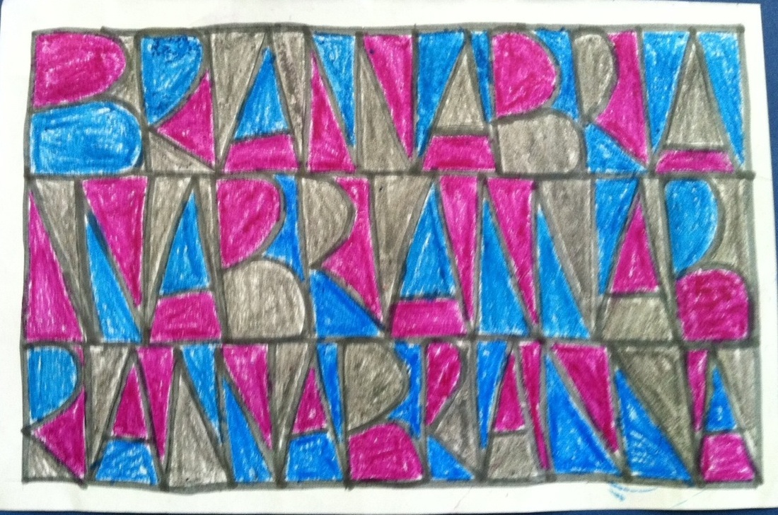
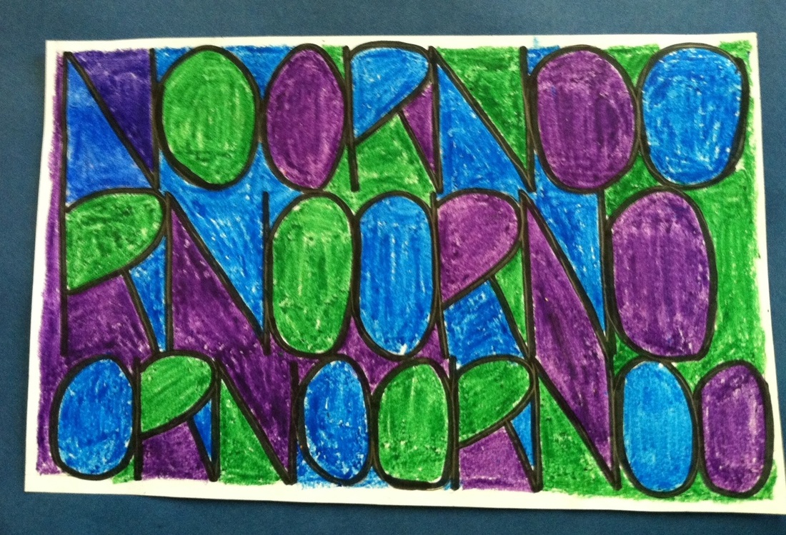
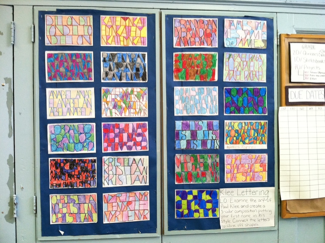
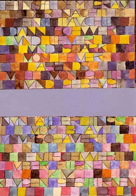
KLEE LETTERING: LETTERS AS GRAPHIC ELEMENTS Students examined the art of Paul Klee and took a long look at his painting, Once Emerged from the Gray of Night (1918). In this watercolor painting, Klee wrote a poem out on watercolor paper and used the letters as graphic elements. By drawing the letters flush up against one other, boundaries were created so that color could flood the newly formed shapes, thus rendering the art abstract. By understanding Klee's process, the students were able to really see what abstraction is as they found a technique to achieve it. As a class we discussed the definition of a portrait. The project's learning objective was to create a three-color composition by abstracting the letters of your first name in the style of Klee’s painting. Students were challenged to design their own color palettes and fill in the resulting shapes so that each color is not immediately adjacent to itself. Presentation of artwork is important so the students designed a 1/8" white border around their composition. To differentiate this project for more advanced students, quotes or song lyrics were used instead of names, which presented the challenge of using smaller letters oriented vertically. |
|
|
Elements & Principles:
1. Line 2. Shape 3. Color 4. Harmony 5. Repetition |
Materials:
• 4.25x5.5" white drawing paper • Rulers • Colored Pencils or Crayons • Digital artwork by Paul Klee • Paul Klee book |